
 Tweet
Tweet
I've "volunteered" to make the UKC national breed club for the Czechoslovakian vlcaks (United Czechoslovakian Vlcak Club a.k.a. UCsVC). I've thought about using for one of our graphics is a flag for the nation of origin flag but we have one small problem - Czechoslovakia no longer exists.
To make it more complicated, the two nations (Czech Republic and Slovakia) have both retained "country of origin" status. the good news is that the Czech Republic kept the most recent Czechoslovakian flag as their own.
I also wanted to incorporate the USA flag since it is the USA's national breed club.
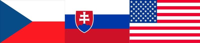
For those of you who don't know the 3 flags, here are the three. Czech Republic to the left, Slovakia to the right, and USA to the left:
When making the flag I thought the Czech Republic should be the most significant since it is also the Czechoslovakian flag, Slovakia second since they are also a founding nation and third the USA.
I also *DO NOT* want the USA portion to go in between the two - I have a feeling that could send the wrong message to some people in those nations (that we were trying to get in between the two nations).
So, I came up with this:

It used the Czech flag as the basis but I turned the blue section of the flag to the stars in the USA flag and the crest on the Slovakian flag on the other half.
What do you think?
I've thought about using the first graphic but much thinner (so it would be the 3 flags together but very thin versions). I've also thought about taking a rectangle the size of a flag and splitting it into 3 (with a "Y") and in the top, Slovakia, to the left, Czech, and to the right, USA (obviously the 3 would be modified to fit and still be recognizable).
Thoughts?
I do have to say, I am very glad that the 3 nations use the same colors, red, white, and blue.
Edit: I've made some changes:

To make it more complicated, the two nations (Czech Republic and Slovakia) have both retained "country of origin" status. the good news is that the Czech Republic kept the most recent Czechoslovakian flag as their own.
I also wanted to incorporate the USA flag since it is the USA's national breed club.
For those of you who don't know the 3 flags, here are the three. Czech Republic to the left, Slovakia to the right, and USA to the left:
When making the flag I thought the Czech Republic should be the most significant since it is also the Czechoslovakian flag, Slovakia second since they are also a founding nation and third the USA.
I also *DO NOT* want the USA portion to go in between the two - I have a feeling that could send the wrong message to some people in those nations (that we were trying to get in between the two nations).
So, I came up with this:
It used the Czech flag as the basis but I turned the blue section of the flag to the stars in the USA flag and the crest on the Slovakian flag on the other half.
What do you think?
I've thought about using the first graphic but much thinner (so it would be the 3 flags together but very thin versions). I've also thought about taking a rectangle the size of a flag and splitting it into 3 (with a "Y") and in the top, Slovakia, to the left, Czech, and to the right, USA (obviously the 3 would be modified to fit and still be recognizable).
Thoughts?
I do have to say, I am very glad that the 3 nations use the same colors, red, white, and blue.
Edit: I've made some changes:


 I used the "smart selection" tool so it was able to get the shield but if I selected the white then the whole top 1/3 of the Slovakian flag would have been selected.
Comment