
 Tweet
Tweet
From Florida's preeminent brewery, Cigar City out of Tampa, we have The Milkmaid, a white chocolate stout. According to the label, it is brewed with coffee and cocoa nibs.
So, it being a stout, naturally the color is....brownish red? Indeed. Unexpected. The nose is unique, almost spicy, but upon further sniffing, it is basically the smell of coffee grounds. Something a non-coffee drinker like myself knows, but is not ultra familiar with. When I had it on draft the other day, I described it more as a funky fruity musky nose. It is definitely more coffee like from the bottle than on draft, but it is still pretty tasty. Less caramely than the draft version, though there is still some caramel to be found.
Weird. Funky. Odd. I like it. 6.5 for the bottle, 7.0 for the draft.
Really, Dale? Is that the best you could come up with? Not Lost Coast's Great White, or Whale Tail from somewhere in New England, or even Sunfish from Seadog?
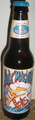
Here's a label for you, from a Florida brewery that has among the best, if not THE best, label artwork all all breweries:

I posted that picture rather than one of a bottle, because a two dimensional picture of the three dimensional bottle makes it more difficult to fully appreciate the artwork, as you can see here:
You're slipping, Dale.
So, it being a stout, naturally the color is....brownish red? Indeed. Unexpected. The nose is unique, almost spicy, but upon further sniffing, it is basically the smell of coffee grounds. Something a non-coffee drinker like myself knows, but is not ultra familiar with. When I had it on draft the other day, I described it more as a funky fruity musky nose. It is definitely more coffee like from the bottle than on draft, but it is still pretty tasty. Less caramely than the draft version, though there is still some caramel to be found.
Weird. Funky. Odd. I like it. 6.5 for the bottle, 7.0 for the draft.
Quoth dalesys
View Post
Here's a label for you, from a Florida brewery that has among the best, if not THE best, label artwork all all breweries:
I posted that picture rather than one of a bottle, because a two dimensional picture of the three dimensional bottle makes it more difficult to fully appreciate the artwork, as you can see here:
You're slipping, Dale.

Comment